Handset Letterpress Metal type Workshop with an experienced typographer in Montreal
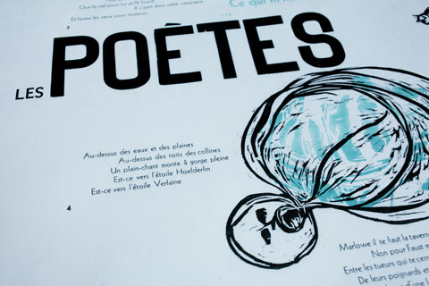
After completing the layout for letterpress text and woodblock illustrations I printed in collaboration with Martin Dufour, an experienced letterpress typographer. I spent a couple of days in his letterpress studio to compose the letters, cut my woodblocks for illustrations, print the five layers (blue type, black metal type, black woodblocks, blue woodblocks, black woodtype), and eventually end up with an edition of 16 beautiful prints. I also spent half a day redistributing the composed letters back into the drawers.
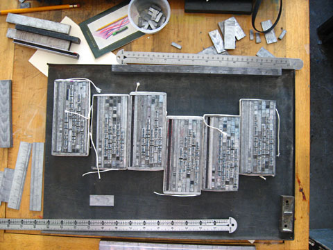
Here is the Making-of Book that contains all testprints that were necessairy to print the posters.
Letterpress typography is a craft that demands real patience and time. A virtue that gets almost lost in our computer-driven world where we try to work faster and always more efficient. Martin Dufour's letterpress studio gives the impression to go back in time where time has another dimension and stress does not exist.
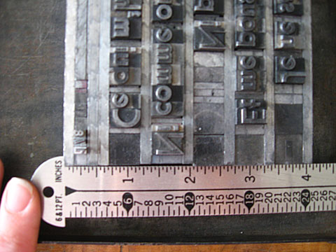
The text is set in 3 sizes I composed in Sans Serif. It is a Sans Serif of an American typerfoundry.: In 14 pt Sans Serif, 18 pt Sans Serif, 36 pt Sans Serif Bold metal type and woodletters. Sans Serif was a lot used in the 1920ies and 30ies. It looks similar to Kabel, a geometric sans-serif typeface designed by German typeface designer Rudolf Koch
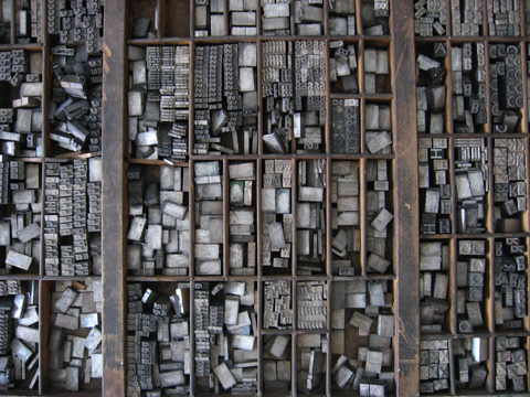
Em et en Spaces in a box that fill the spaces in between the letters: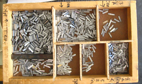
1 em is a unit of measurement in the field of typography. It is applied to all letter sizes, in this case to 14pt. An em is the height of the metal body from which the letter rises.1 em devided in half is called 1 en. Taken 2 en make 1 em. There is also ‘3 on em’, which means three of these measurements make 1 em. And there is '4 on em', taken four of them eqals 1 em. There is also '5 on em', taken five of them eqals 1 em.
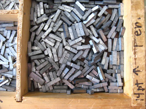
1 em:
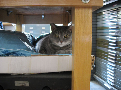
Cat named "Bouillotte" (hot-water bottle) in the letterpress studio:
36pt Sans Serif Bold, in drawer:
Letter blocks of the text set in 18 pt Sans serif:
Line height is 12 pt for the 36pt Sans Serif Bold text:
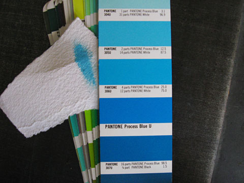
Pantone Reflex Blue Printing Inc:
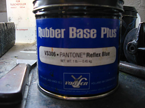
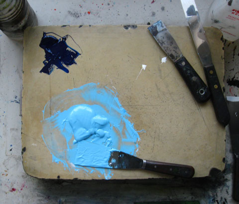
To obtain the right blue inc, 4 parts of blue and 12 parts of white are mixed:
Pantone Color book:
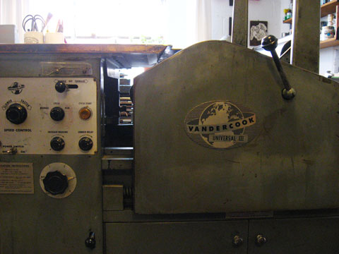
Vandercook Universal 3 Press:
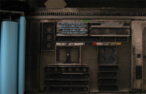
Blue text on printing press:
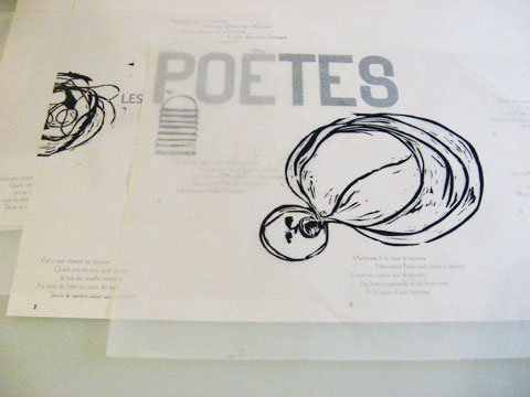
Positioning of letter blocks on the press through printing on the same sheet of paper. To be able to distinguish to new from the old version, the first letters are highlighted with a pencil:
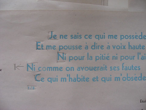
Positioning of letter blocks on press:
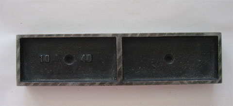
Metal that helps to position the letter blocks on the press in the size 40 x 10 pica. (Or 40 x12 pt by 10 times 12pt) It is used to fill the space on the press:
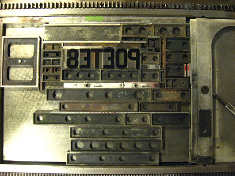
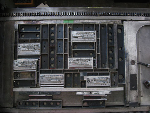
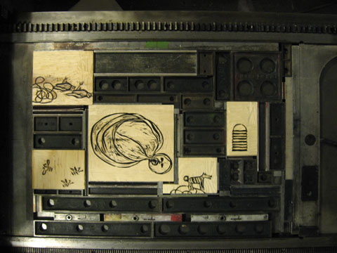
Letter blocks on press:
On the light table original layout and print are compared and the type can be positioned accordingly:
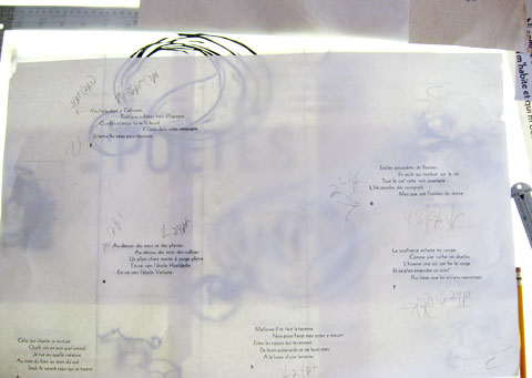
The later printed xylography prints on transparent paper are positioned on top of the print to help to decide if the type is on the right spot:
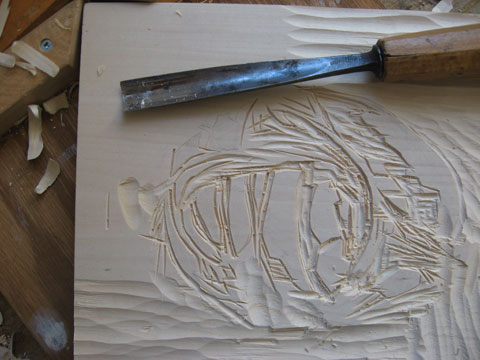
Linden woodblocks that are cut:
Linden woodblocks with illustrations on press:
- Tags