Book Review: Max Bill kontra Jan Tschichold (Hans Rudolf Bosshard), Reviewed by Brigitte Schuster in June 2013
(Originally, this book review has been written for Codex the journal of letterforms, which was discontinued as a journal. Under these circumstances, the book review could no longer be published.)
15 × 22 cm; 120 pages; more than 60 illustrations; linen cloth with jacket; German; Sulgen/Zürich: Verlag Niggli AG, 2012; ISBN 978-3-7212-0833-7; 38,00 CHF, 29.80 EUR (D); 30.60 EUR (A);
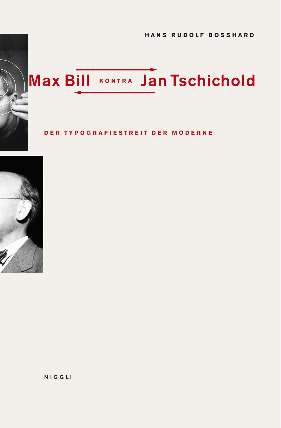
Cover: Max Bill kontra Jan Tschichold (Hans Rudolf Bosshard), courtesy of Niggli Verlag.
Max Bill kontra Jan Tschichold is about an argument between Max Bill and Jan Tschichold, the well known "Bill-Tschichold dispute", triggered by Tschichold's talk entitled "Konstanten der Typographie" in 1945. In that talk Tschichold claimed that the 'new typography', which he had helped define in 1928 and in subsequent years vehemently defended in several publications starting about ten years earlier, was no longer advised for certain editorial designs, such as literary books. (1) Bill was completely upset by Tschichold's statement and reacted to it with the publication of an essay entitled "Über Typografie" [On Typography] in the April 1946 issue of Schweizer Graphische Mitteilungen. The dispute continued with Tschichold’s essay “Glaube und Wirklichkeit” [Belief and reality] in the June 1946 issue of the same journal, in which he analyzed the dispute in question [Bill-Tschichold dispute] regarding historical, situational, and political aspects explaining his shift from modernist to traditional typography.
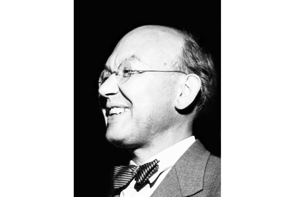
Jan Tschichold in the 40s, photographer unknown, courtesy of Niggli Verlag.
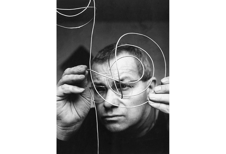
Max Bill in the 40s, film still from the movie ‘max bill – das absolute augenmass’ by Erich Schmid, 2008, photographer unknown, courtesy of Niggli Verlag.
Max Bill kontra Jan Tschichold consists of four parts: Hans Rudolf Bosshard's analytical essay, "On typography" (Über Typografie) by Max Bill, Tschichold's essay entitled "Belief and reality" (Glaube und Wirklichkeit), and an afterword/epilogue by Jost Hochuli. Bosshard deliberately chose this way of structuring the book, placing his own interpretation before the original texts. This assumes—perhaps unwisely—that the reader is already familiar with the original texts or at least with the arguments embodied in them.
Bosshard introduces his essay by referring to historical examples, such as the writer and publisher Friedrich Justin Bertuch, Baskerville, Bodoni, William Morris, or Stanley Morison. Hence, from the beginning, he puts the dispute into a larger context by connecting Tschichold’s point of view to classical and ornamented typography from the past. In the same manner he introduces the ‘new typography’ as defined by Max Bill (pp. 7–9). Then, he introduces Bill’s and Tschichold’s way and philosophy of working, as well as their body of work. He does this as a direct comparison, e.g. looking at how both were involved in type design (p. 28), and by according them their own chapters. The detailed background of both antagonists in the context of the dispute helps the reader to get a better feeling of how and why both argued and reacted to each other in the way they did.
Bosshard also provides an in-depth explanation of the political aspect of the dispute. Bill started the political argument, claiming that traditionalists, such as Tschichold, were following and being taken in by the Nazi regime. In defense, Tschichold argued that modernists, such as Bill, shared the same principle of delusion of order with the Nazis (p. 35). Hence, both accused each other of making use of typography favored by the Nazi regime.
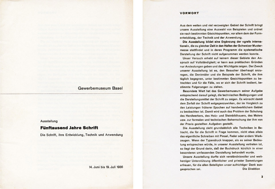
Jan Tschichold, catalog without an envelope, first and third page, Crafts Museum Basel, 1936, format 14.8 x 21 cm, two exhibition catalogs designed according to the spirit of the ‘functional’ or ‘organic’ typography, courtesy of Niggli Verlag.
After a detailed account of both antagonists, Bosshard responds to the dispute itself by making reference to what others said. For example, he integrates Paul Renner's reaction (1948) towards the dispute, with his own interpretation. (Along with Renner, Bosshard also refers to other voices in this context, such as the Austrian architect Adolf Loos. Paul Rand's reaction in 1993 is mentioned as well.) He suggests reasons for Bill's apparent overreaction to Tschichold’s statements. There might have been a personal problem between both, although we do not know what nature it was. Without having much evidence, we assume that Bill possibly helped Tschichold when immigrating to Switzerland. We do not have any proof, just some indications (p. 32). Bill’s letter to Paul Rand in 1946 contains "Tschichold ist daran, die Schweiz zu verlassen, und so werden wir das Übel endlich wieder los, das wir von vornherein eingeladen haben." (Tschichold is about to leave Switzerland, and we will finally get rid of the evil that we have invited in the first place) (p. 43) Here, in a tone of antipathy, Bill is is glad to see Tschichold leave the country; his feelings of betrayal by Tschichold being no longer of one mind with him might play a role and be part of the problems stressing their relation at that time. Tschichold's and Bill's personalities, the level of personal aggression they employed, as well as their obsession with principles (p. 44), influenced the severity of the dispute (p. 49). One can say that without their particular way of thinking the dispute would not have gone far. Both had their personal way of arguing as well: Tschichold's style of writing is polemical and at the same time conciliatory. E.g., with “ich bin übrigens nicht einer der bekannten Typografietheoretiker, sondern […] der einzige" (I am not, by the way, one of the 'well-known typographical theorists', but […] the only one”) (p. 89, Belief and reality) Here, Tschichold exaggerates to defend himself against Bill. On the other hand, with "alle Bücher Bills zeugen von großem Formgefühl und sicherem Geschmack" (all of Bill's books show great feeling for form and a sure taste) (p. 95, Belief and reality) Tschichold complimented Bill and showed the first steps of reconciliation, which Bill completely ignored. Bill has a tendency to write rather argumentatively, although his writing contains a few polemical approaches. “Typographie ist die Gestaltung von Satzbildern” (Typography is the design of text-images) (p. 81, On Typography), is, for example, an informative sentence without being personally colored.
Without doubt, the dispute brought attention to Tschichold's change in his way of thinking about and using typography. One can wonders if such a dispute could take place today, or if this was rather an event of its time. We currently live in a period where we can make use of every style the history of typography provides us with. The 'new typography' is not any better to us than 'classical typography', the opposing poles of this very dispute. Furthermore, when looking at periods in the arts, such as the transition from Gothic to Renaissance, we can see that elements of one style merged with the other fluently.(2) All this makes the Tschichold/Bill debate seem ridiculous and exaggerated to us today. But at that time, the discovery of the 'new' in typography was an absolute novelty in the way it was perceived. Typography was not just typography in its actual sense, it meant more than that: it was part of a whole ambition on the part of designers for social solidarity. On a formal level this 'new typography' revealed the spirit of the time. The look of the typography results from the function of the text, characterized for instance by asymmetry.(3) Therefore, it is also understandable that for Bill the 'end of the new' meant the breaking apart of an entire world.
Jan Tschichold, inside cover, 1945, format 32 x 24 cm, courtesy of Niggli Verlag.
Jost Hochuli's afterword concludes Max Bill kontra Jan Tschichold with rich contributions to the earlier factual information. Hochuli tells us that both antagonists eventually reconciled later in their lives. Although we do not know when and how it happened, all we know is that they did. Mrs Tschichold told the team, among which was Hochuli, that picked up the Jan Tschichold library in Berzona, Switzerland in October 2010 to deliver it to the Kantonsbibliothek Vadiana St.Gallen (Cantonal library Vadiana St. Gallen) about a meeting of both Tschichold and Bill in Berzona some time between 1967 and 1974. Bill came to visit Tschichold in his garden over a glass of wine (p. 107). Hochuli points out that Bill’s strong reaction towards Tschichold’s renunciation of the ‘new typography’ seems awkward considering that Tschichold’s changing opinion was a progressive one and noticeable in his writings years before the provocative talk of 1945. Speaking from his own experience, Hochuli, who had personally known Tschichold, provides the reader with an authentic historical context. His voice is a most appropriate one for the afterword.
Hans Rudolf Bosshard is an expert in the development of the 'modern typography'. He has researched the subject thoroughly and from different angles. Evidence for the various arguments by Tschichold and Bill is provided in footnotes, which are often quite extensive. For example, one describes not only the newspaper Die Nation itself, but refers even to a movie dealing with intrigues of the later chief editor (p. 25). For readers, who want to dig deeper into this subject such detailed background information is certainly helpful. There are parts in the book which are not completely clear, e.g. Nachsätze (p. 61) contains quotations that appear to have no connection to the main text. It it confusing for the reader that they are left by themselves without being integrated into the text and explained within the book's context.
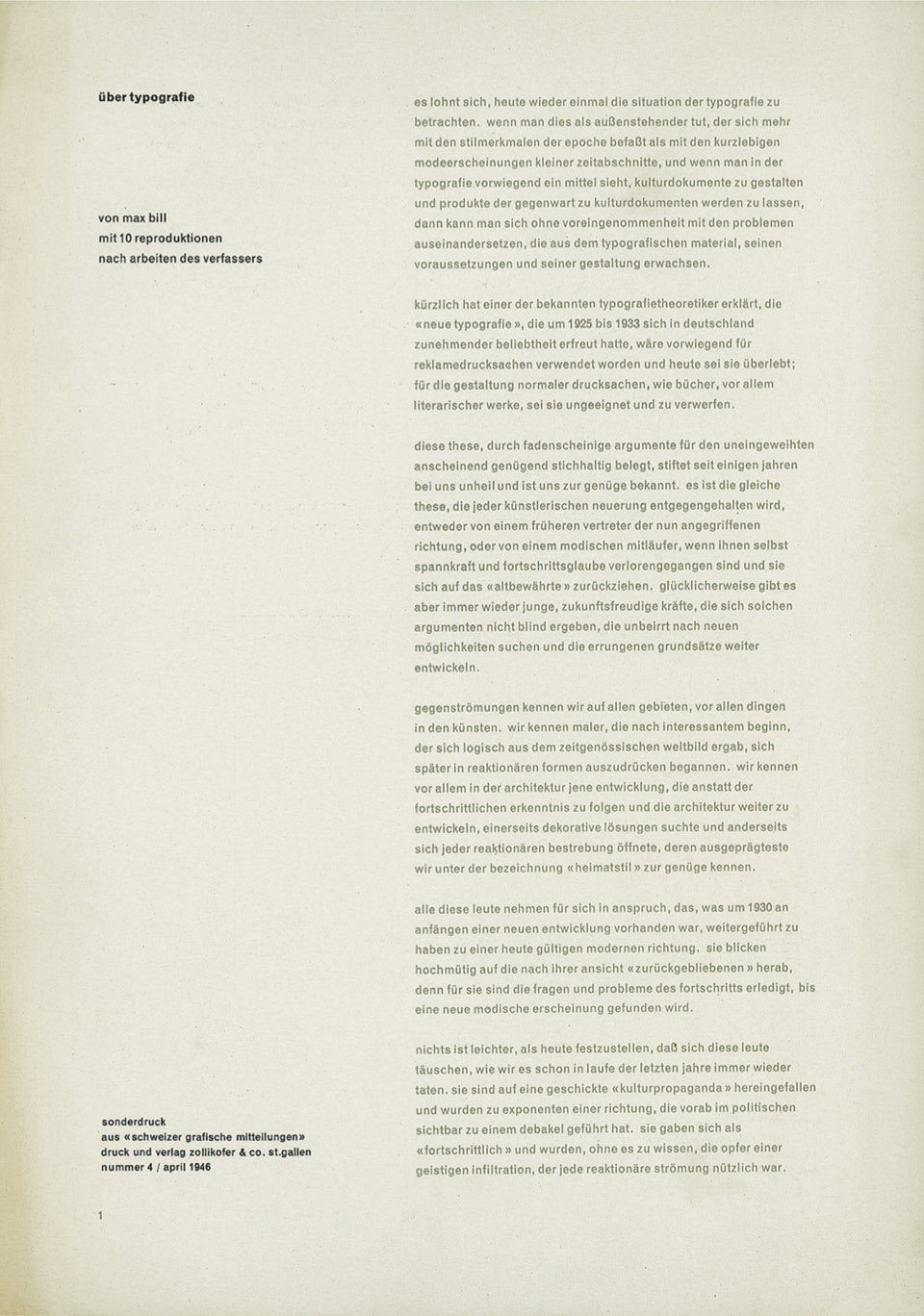
Max Bill, “über typografie”, First of eight pages, “Schweizer Graphische Mitteilungen”, 1946, offprint, gray and black on yellow paper, format 21 x 29.7 cm, courtesy of Niggli Verlag.
Overall, Bosshard's style is objective/factual (sachlich). In a few places he colors the information in a more subjective but at the same time entertaining way, e.g. "Verzierungssucht" (addiction to ornaments) (p. 8), as well as "die gotischen Schriften der Nazizeit […] waren ein untrügliches Zeugnis schlechten Geschmacks" (the gothic typeface of the Nazi era […] were an unmistakable evidence of bad taste) (p. 40). In the former example, Bosshard is negatively attuned to ornaments, while in the latter he judges the typefaces used in the Nazi era to be of bad taste. Hence, in some parts of the text, he reacts with his own interpretation in a rather vehement way. This makes the text accessible to the reader, because it gives it a personal touch. While Bosshard aims to be neutral towards both antagonists in the dispute, in some parts he seems to side with Tschichold, e.g. when defending him against Bill, when the latter gets into non-relevant political arguments (p. 35).
The book's design follows a modernist rather than traditional design. Bosshard, who is also the book's designer, makes use of the sans serif typeface Akzidenz-Grotesk BQ. The typographical grid seems to be based on the baseline grid, as images are rather loosely distributed on the page. Thus, the design is clean and simple. What stands out, in fact, in a rather disturbing way, is the design of the running heads on the outer margins. They appear in a different typeface than anywhere else in the book; this typeface is also italicized and set in a different color than the main text. This disrupts the overall harmony of the book as a whole. Bosshard introduces a playful element with a more subtle effect: throughout the book, the title typography Max Bill kontra Jan Tschichold, set within arrows, is picked up for the chapter openings with the arrow pointing in the direction that relates to each text's meaning.
The book is hardcover, bound in sections. The binding has the advantage of helping the book to lie flat. It is printed offset on matte coated paper. The full-color printed chapter divisions look rather unpleasant because the choice of paper gives them a glossy appearance. Works mentioned in the text are illustrated throughout the book. However, not all illustrations are referenced in the text, such as works by Bill or Tschichold from different periods of their creation, which are incorporated all over the book (p. 34 and 39). No direct reference in the text points towards them. However, they still work well in itself to give a good overview of both antagonists’ oeuvres.
Jan Tschichold, book cover from 1945. Book title with the same text in ‘functional’ typography. With the second example Tschichold aimed to demonstrate that the ‘functional’ typography does not match the content it represents, courtesy of Niggli Verlag.
The Bill/Tschichold debate has not previously been discussed to the extent Bosshard does in this book. Compared to previous publications on the Bill/Tschichold dispute, the present book represents a more detailed analysis of the texts of both antagonists. It can truly be seen as an addition to existing material, such as Typography Papers 4: “The dispute between Max Bill and Jan Tschichold of 1946, with a later contribution by Paul Renner”, which includes a reprint and translation into English of “On typography” by Max Bill as well as “Belief and reality” by Jan Tschichold. It also features a preface by Christopher Burke interpreting the dispute differently than Bosshard does. Burke includes in his text primarily Paul Renner’s point of view, derived from his article “Über moderne Typographie” in 1948, which focuses on the divergent points of the protagonists’ opinion part rather than the details of their arguments. (4) Burke’s article refers for example to Gottfried Semper’s design theory from 1848 dealing with purpose, material, and technology. This theory initiating functional thinking, was apparently a common ground of knowledge for the time, and therefore known to Bill, Tschichold, and Renner. According to Burke this was also a debate about technology with Bill believing in technologies and Tschichold countering with “soul-destroying labor”. The debate eventually represented a struggle towards the “conciousness of consequences of typographic practice”. What Burke’s analysis of the dispute offers us is different and less detailed than the information Bosshard provides. Hence, the information in Bosshard’s book is not redundant, but rather an addition to the subject. Typography Papers 4 also includes “On the bibliography of the debate” by Robin Kinross which gives a good overview of German- and English-language writings on the Bill/Tschichold debate.
Recently, a new, unpublished, document relevant to the Bill/Tschichold debate has emerged from Tschichold’s private archives in Berzona, Switzerland, through Oliver Tschichold, Jan Tschichold’s grandson. It is a friendly/sympathetic letter by Aline Valengin, written June 6, 1946 and addressed to Jan Tschichold. This letter is a testimonial in favor of Tschichold’s defensive essay “Belief and Reality” (Glaube und Wirklichkeit), which had just been published in the June edition of Schweizer Graphische Mitteilungen. At the same time she reports her experience of visiting Bill. The moment she is at the latter’s house, he receives a phone call, in which he is being given an account of Tschichold’s essay. This puts him, according to Valengin, in a state of rage. This document reveals Bill’s immediate reaction and emotions towards Tschichold in the dispute.
Further reading:
Substantial review essay: Maurice Meilleur, 'Book review: Max Bill kontra Jan Tschichold: Der Typografiestreit der Moderne', in Typographica (January 29, 2014) [accessed 7 October 2015]
- The following publications by Tschichold promoted the ‘new typography’: “Elementare Typographie” (special issue). Typographische Mitteilungen, Leipzig, 1925.Die neue Typografie. Berlin: Verlag des Bildungsverbandes deutscher Drucker, 1928.Typographische Gestaltung. Basel: Schwabe, 1935.
- Hochuli, Jost. “Bauhaus, Zürich, Basel – und einiges daneben”, talk, Vienna: tga. 17 April 2013.
- Hochuli, Jost. “Die neue Typografie von Jan Tschichold – endlich einmal genau gelesen”, talk, Vienna: tga. 18 April 2013.
- Burke, Christopher, and Robin Kinross. ‘The dispute between Max Bill and Jan Tschichold of 1946, with a later contribution by Paul Renner’, in Typography Papers 4, Reading: Department of Typography & Graphic Communication, 2000, pp. 67–90.
- Tags