Typography - Emphazing the typeface - Type conference by Grafika days

Denis Dulude
On Tuesday, October 23, 2007 grafika organized a typography conference ('Typographie - Maximiser le caractere des letters'). First lecturer was Denis Dulude, Designer and typographer, founder of the typefoundry 2Rebels and the studio KO creation. He showed his experimental print and motion work.
After a career as a ballet dancer for 15 years he started off as a graphic designer. It is pretty interesting that he tries to use his personal style even in his commercial projects, although he explains that he goes through frustrations, because clients often don’t understand the value of his design.
Apart of his graphic design work he also showed some of his silkscreen projects, which he is doing for pleasure. He explained that executing these projects is like 'playing golf'.
He mentioned artist and graphic designer Ed Fella, who has inspired his work.
David Cabianca
David Cabianca, associate professor in graphic design at the University York, Toronto analyzed new tendencies in design going back in history of graphic design.
Peter Gabor
Peter Gabor, graphic designer, Graphiklab, Paris. He lectured about digital typography including a historical retrospective.
He is founder of Typogabor, one of the most famous ateliers of photocomposition and photo printing.
Peter Gabor's blog is a great source of information about of contemporary and historical typography.
Ted Harrison
Ted Harrison, President of Fontlab, Vancouver, presented their new product photofont which will be in competition with other technologies on the market to display any font on the web.
We are still facing the problem of being very limited in font choices on the web. To overcome this problem he mentioned potential solutions as
Microsoft's EOT technology: OpenType or TrueType fonts compressed with Microtype
EOT advantages: Uses standard TT/OT fonts, Uses simple HTML tags and CSS, infinite scalability
EOT disadvantages: No multicolor text -same limited color, no multicolor text -same limited color, no multicolor text -same limited color palette, no grayscale, no transparency/translucency, no Type 1 compatibility, requires W3C approval and adoption by all browsers
Cascading Style Sheet spec championed by Hakon Wium Lie of Opera
Advantages: Just add a new feature to CSS, uses standard TrueType fonts, simple CSS specification
Disadvantages: TrueType centric, no compression leading to big files, no multi-color, no grayscale, no transparency/translucency, requires W3C approval and adoption by all browsers
Photofont
Advantages: Multicolor/gradient/texture, grayscale, transparency/translucency, TT/OT/T1 compatibility, no W3C approval or browser modifications necessary
Disadvantages: Not a standard font format (yet), requires plugins for use, big files, limited scalability, no multiline text (yet)
sIFR
To overcome the limitations of HTML he mentioned sIFR used by sites like Nike, ABC, NYTimes, Aston Martin, etc.
How sIFR works: Convert a TrueType font into a Flash font, CSS contains a style for replacement, javascript parses HTML for tags, replaces text within tags by Flash font.
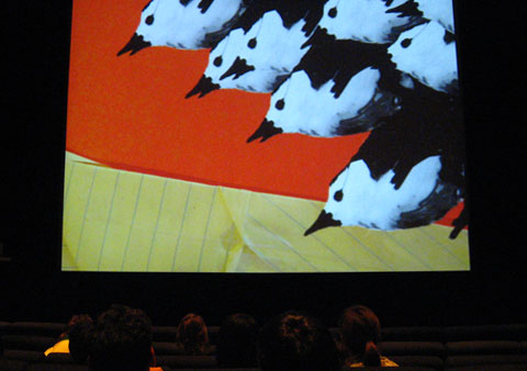
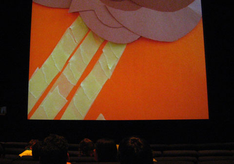
Grafika trailer, made out of animations of the raw material of the animated artifacts:
- Tags