Concept development in Marketing and Advertising
Marketing and advertising concepts can be approached in very different ways. Subjects dealing with negative aspects of life have to be approached more sensitively than a funny subject.
In the following, the advertising concept as a framework and strategies to catch attention/interest are listed. Also, examples of formal techniques of visualization are revealed. The strategies and formal techniques of visualisation can be applied to marketing (direct marketing, online marketing) or advertising for the mediums print, Web, TV and radio.
A subject can be remembered more easily if the mind finds itself in an emotional ecited state.
The advertising concept defines framework
The advertising concept is basically the framework in which the campaign has to be situated. Important points to consider are consumer benefits (for example: This shop sell Cds), the reason why (for example: This shop is the cheapest) and the tonality (for example: the use of teasing words in campaign slogans). The more an ad includes criteria like catching of interest, relevance, credibility, retentivity, continuity the more it will be successful. The target group plays an important role as well [1].
Strategies to catch attention/interest [1]
Emotion related subjects
A subject, which means also a brand name, can be remembered more easily if the mind finds itself in an emotional ecited state. This kind of an emotional excitement can derive from sexual hints ("sex sells"), as well as fear, disgust or anger, humor. This has been confirmed by experiments in the field of educational psychology.
An example for an emotion related advertising is the anti tabac ad 'You don't always die from tobacco'. (Marlboro) Cowboys in the city sing a country song with changed wordings "You don't always die from tobacco". One of them is able to sing only because of using an advice, as he has lost his voice related to a tobacco related disease. People are around that show emotions of disgust.

Emotion related subject in an ad for french lingerie. 'We do know now what Eiffel had in mind when he designed the tower.', Client: La Vie en Rose, Agency: Strusi Estudio Creativo, Caracas, AD/Photo: Gina Strusi
Repeating of an ad
It is in the human nature to remember a message consciously after seeing it in average seven times. That's why some brands focus on a repeated showing of the ad.
Celebrity presents product
Having a celebrity promoting a product can have the effect that people think this product is mainly used in a higher class society and therefore increases the attractiveness of achieving it.
Expert knowledge
Testimonials of product users or/and experts. For instance, "three out of four dentists recommend..." Showing science is convincing as well. This is usually shown troughout microscopical photos, white coats or charts.
Artificial lack
Through the strategy of pretending artificial lack advertising seeks to make people buy quickly without giving them time to think about. An example is Futurshop is selling the professional Graphic Tablet. The tablet can only be purchased online and the "sale ends" usually in a quite limited timeframe and "quantity remaining" is low.
Conjunction with desirable situations
Associations. The product is visually or in terms of sound shown in conjunction with desirable situations. These situations can i.e. be created through attractive models or picturesque landscapes. This makes the product more desirable as well.
Use of avatars
Avatars representing certain characteristics are used. For example, a housewife receives the cleaning product Mr. Clean with a male avatar. She can project a very attractive characteristic onto this avatar and finally the product.
Shocking
Shocking advertising with negative associated subjects is used as well. A well-known example is the Benetton campaigns by Oliviero Toscani, showing blood-soaked clothes of a soldier. A softer form of shocking could be the communication of surprising information, like statistical facts.
Examples of formal techniques of visualization [2]
Figure and ground
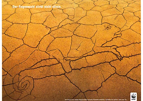
'It's not just the rainforest that's dying. You can protect the last rainforest on our planet. Give online at: www.wwf.de.' Client: WWF Deutschland, Agency: Ogilvy & Mather, Frankfurt am Main, AD: Simon Oppmann, Esra Paolo Crugnale
Two and three dimensions

Sticker with aptly placed warnings, Client: Anti Drink Driving, Agency: Theme Media & Production, Singapore, AD: Perry Goh, Photo: Wei Ming (Creative District)
Foreground and Background
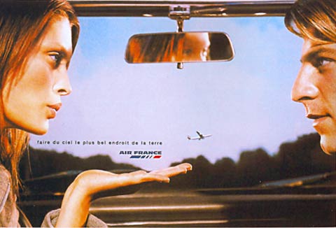
"Make the sky the loveliest place on Earth."Client: Air France, Agency: Euro RSCG Worldwide France AD: Florence Belisson, Aurelie Scalabre, Etienne Turquet, Photo: Steven Klein
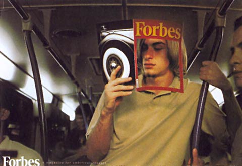
Client: Forbes, Agency: Bates Brasil, Sao Paolo, AD: Sergio Gordhilo, Photo: Felipe Hellmeister
Big and Small
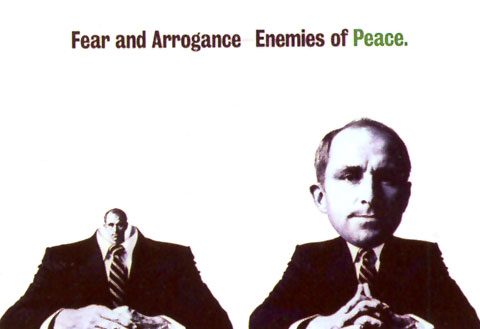
Client: Greenpeace, Agency: Mukai & Associates, Tokyo, AD: Hideo Mukai, Photo: Eiichiro Sakata
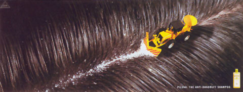
Anti-dandruff shampoo, Client: Pilena, Agency: Tiempo BBDO, Barcelona, AD: Gabriel Penalva, Photo: Ramon Serrano
Compositions
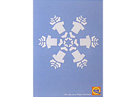
'We wish you a white Christmas', Client: Vizir, Agency: Leo Burnett, Warsaw, AD: Martin Winther, Photos: Sebastian Hanel
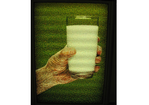
Client: le lait, Canada, Many small faces built the image.
Setting up a scene

Client: Erdal, Agency: Jung von Matt/Alster, Hamburg, AD: Hans Weishaeuptl, Photo: Kristian Rahtjen.

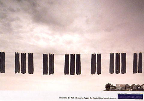
A piano shop. 'Hear the world with different eyes.'
Seeing in context
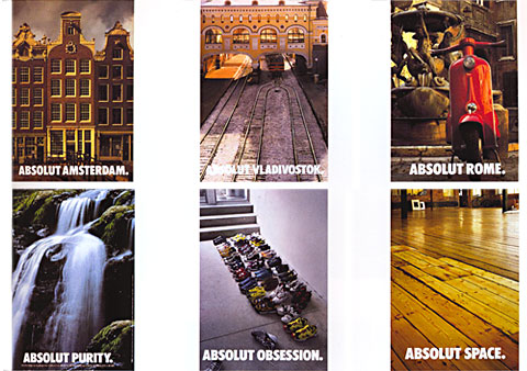
Over twenty years of ads, the Absolut vodka bottle has been given many new forms, Client: Absolut Vodka, Agency: TBWA, Paris, AD: Pascale Gagrand, Photo: Paul Wakefield, Vincent Dixon, Serge Paulet
To connect a product with a context out of the common the following techniques can be considered:
- Methaphors
- Methaphors are supposed to make complex ideas easier to understand. "The key to methaphorical thinking is similarity". The First automobiles were for example called 'horseless cars' [3, p 48]. It has been experienced that some of the most fertile and easiest to develop metaphors are those in which some action is taking place". For example, in the Bible ideas are expressed metaphorically [3, p 50-51].
- Comparison
- A product can be compared to very different subjects, caracters, etc. For example: What is the meaning of life? - Life is like a Bagel. It's delicious when fresh and warm, but often it's just hard. - Life is like eating a banana. You start out green and get soft and mushy with age. - Life is like cooking. It all depends and what you add and how you mix it [3, p 52].
- Alienation (Connection to opposite meaning)
- Pepsi Light "Getraenkekisten Light" Client: PepsiCo Deutschland, Agency: BBDO Campaign
- "Life is too short for the wrong job - jobbank"Client: jobsintown.de, Agency: Scholz & Friends
- Use of unexpected object
- McDonald's Austria "bread and butter". Nice attempt, Mama.Client: McDonald's, Agency: GBK, Heye Werbeagentur
- Before and after
- "Direct mail card" On the back there is a transfer form. It has to be pulled from the slipcase. This emphasizes the result of the donation: A child finds its way from the street in a save home. Client: Kindernothilfe, Agency: Scholz & Friends
- Relation to history
- "Welcome to Sant'Agata Bolognese. Home of Lamborghini."
Client: Automobili Lamborghini, Agency: Philipp und Keuntje
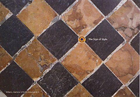
Burlington socks with their checked pattern and trademark button. Client: Burlington Agency: Springer & Jacobi Werbung, Hamburg AD: Birgit Hogrefe, Photo: Birgit Hogrefe
- Quote or proverbs
- stylistic devices as used in literature (alliteration, anapher, oxymoron, paradoxon, tautology) can be used as well.
Outlines
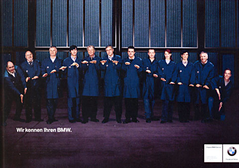
'We know your BMW.' Client: BMW, Agency: Jung von Matt, Hamburg, AD: Tobias Eichinger, Photo: Uwe Duettmann
Words and Pictures
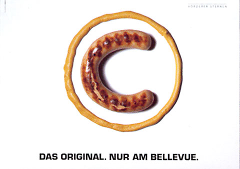
'The original, only at Bellevue.', Client: Restaurant Vorderer Sternen, Agency: Seilerzuerich, Zuerich, AD: Matthew Katumba
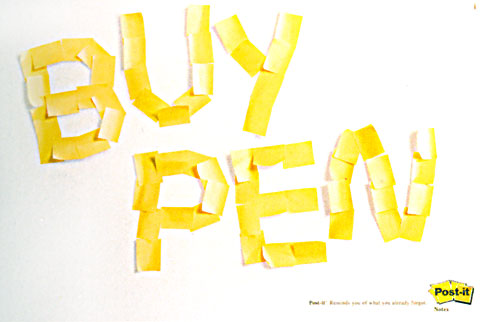
Client: Post-it, AgencyGrey Worldwide, Sao Paolo, AD: Ulisses Agnelli, Photo: Fernando Moussal
On the spot
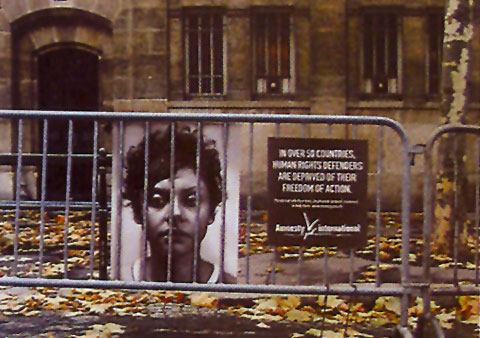
Client: Amnesty International, Agency: TBWA, Paris, AD: Philippe Taroux
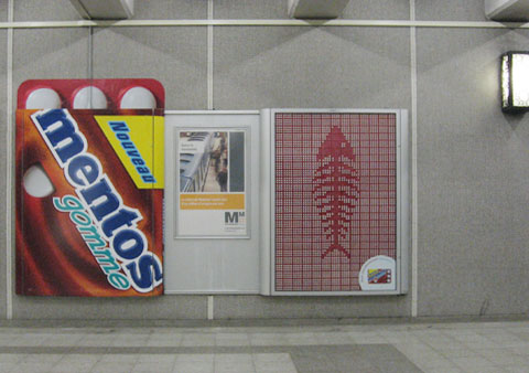
Client: Mentos
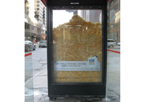
Client: Visa
Conclusion
A good way to learn about developing visual concepts for marketing and advertising is probably the analyzing of existing ads, for example on Ads of the World, which is an advertising archive and community showcasing the best and most interesting work worldwide. There is also Rejected Online - The Best Rejected Advertising.
This article can be used as a sort of how-to-do guide for visual concepts and can also be seen as a source of inspiration. It contains some important issues, but could obviously be completed.
Works Cited
- http://de.wikipedia.org/wiki/Werbung#Konzeption_und_Umsetzung
- Stoklossa, Uwe. "New Techniques for Visual Seduction". New York, 2007
- Von Oech, Roger. "A Whack on the Side of the Head - How you can be more creative". New York Boston, 1998
- Tags
Interactions
5 interactions
 sekhar babu Badde replied on
Use ful stuff for growin designers
 Alex Mizban replied on
Hi, my name is Alex Mizban and am a an ICM-International Communication Management student from InHolland Univ. of Applied Sciences. Am from US and study here in Amsterdam-Holland. I really like your page and it seems you are a person who looks for the quality of work. There was just a few misspelling in ur article, wish that you will correct them. In addition, u had to ad a little text explaining some parts e.g. Alienation (Connection to opposite meaning), Use of unexpected object and some other parts that unfortunately their links that u have provided not working. Thanks again, I have already post this beautiful article on my facebook page.
 Dirk replied on
Hi Brigitte,
Thank you for a great blog. I was wondering if you could help me on how to cost for radio concepts.
I come from a production studio and want to add advertising concepts, slogans and so forth to my service offerings. Am unsure how to quantify value or work out a quote for radio concept.
Example; company sells products in chain stores over the country and I was approach to work out radio advertising concept for both major products. I am unsure how to quantify the value of my concept and present it in value in a quote to furnish client.
Any feedback or suggestions would be helpful thanks. Dirk
 Safyan Ali replied on
Hi,
I found your details on internet and get interest to share one of our requirement for advertisement. We are a manufacturing company (HQ is in Germany) and we manufacture safety PLCs. Our product is generally installed in Oil & Gas and process Industry to save people working in industry, Industrial assets & the environment. We also have a special product who’s slogan is “Safety Nonstop”.
With the above details, we want from you to develop some conceptual images which represents the following themes:
Image#1 -Plant/process Safety Image#2 -Persons, assets & environment is safe with our product installed at customer site Image#3-Use HIMA for maximum Safety and profitability (Safety Nonstop) Image#4-Use Expert & Specialized product for your plant safety
Please feel free to discuss details or to get more clarifications. I appreciate your offer for approx. cost to develop each conceptual image.
Look forward to hear from you.
 Ejiofor Marvis replied on
Good day,I just read your article and I find it very useful.I advert ideas/concepts with good slogans to back it up but I don't know to get it across to the companies or agents for business.