Lifesans Typeface Design
- project: A three-weight lowercase sansserif typeface design
- 2008
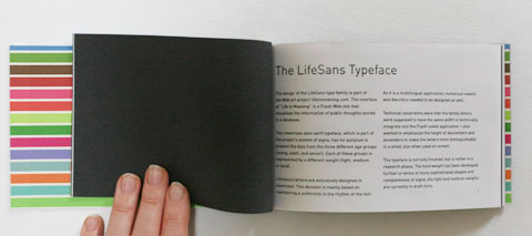
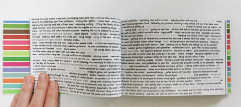
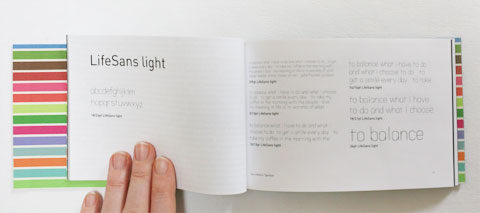
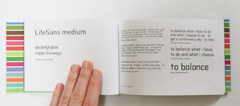
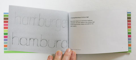
- A booklet [in PDF] features LifeSans Family and its Creation Process. A three-weight lowercase sans serif typeface in light, medium and bold.
- It has been designed with the purpose of representing the visualization of three different age groups for the online-project lifeismeaning.com.
- Results and future work:
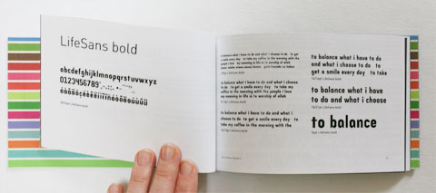
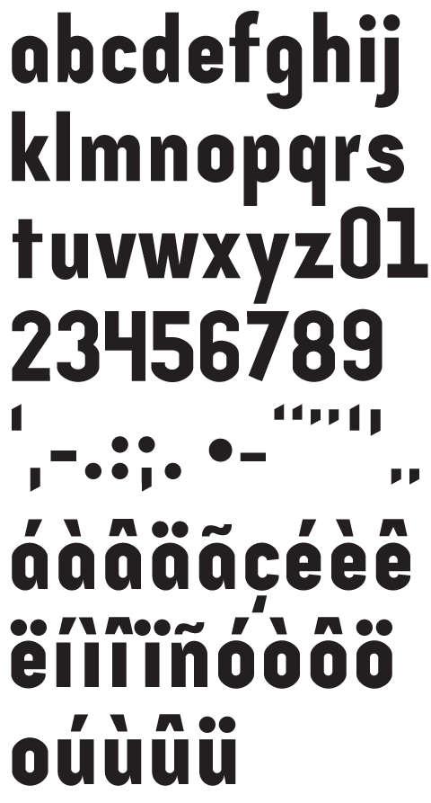
- Eventually, I focused on the LifeSans bold weight, for which I developed more sophisticated shapes and more glyphs. I wanted to get at least one weight properly designed in my restricted schedule.
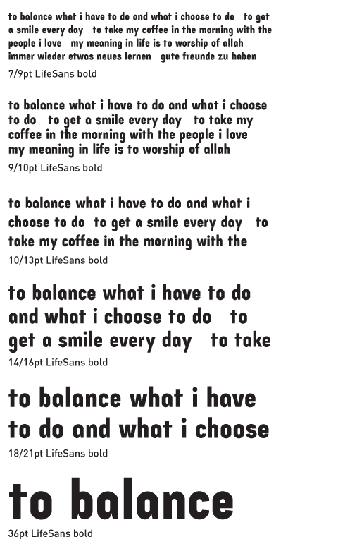
- Because of the fact that LifeSans uses the same width for letters in all weights, the bold version has a condensed feel. This could be improved in future work if this technical restriction requiring the same width for all versions could be eliminated.
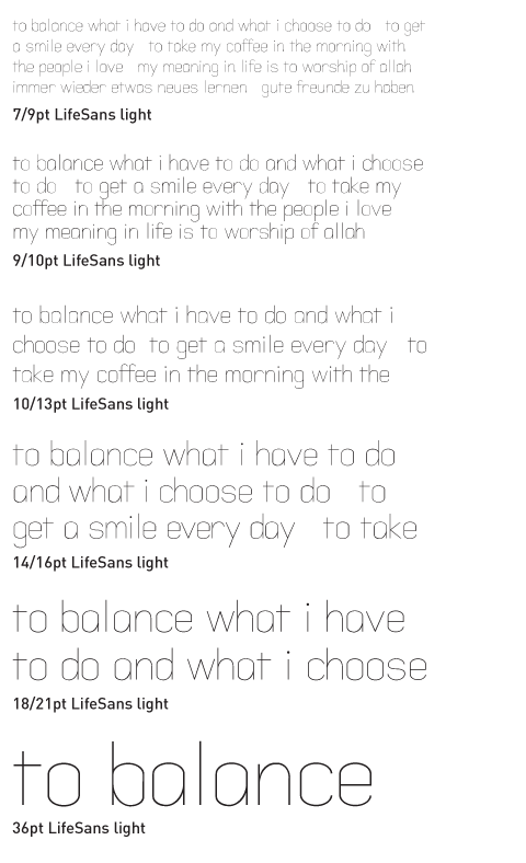
- LifeSans light is too thin for on-screen use, although hinting has been applied. A solution could be found by increasing the size in the visualization of the Flash application.
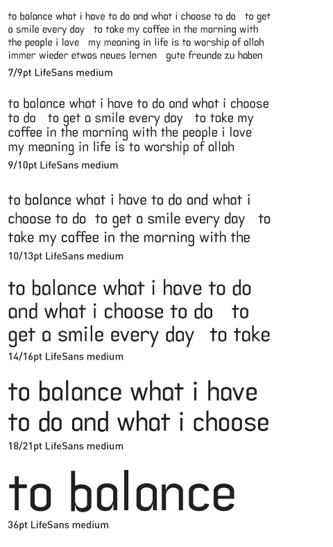
- LifeSans light and medium definitely need to be reworked in terms of shapes, metrics and kerning. For example, right now, LifeSans light looks too stiff
- The use of the LifeSans typeface in printed matter should be considered. This could be a font used at the same time for print and web.
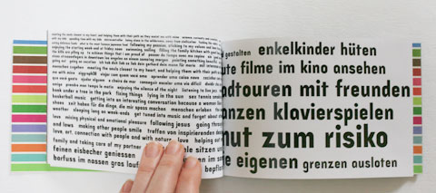
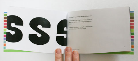
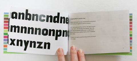
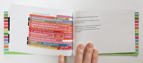
Interior of Lifesans Typeface booklet:
The LifeSans Typeface:
Lifesans bold character Set:
Lifesans bold:
Lifesans medium:
Lifesans light:
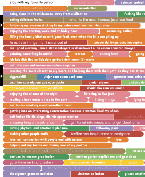
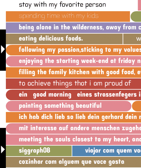
On-screen tests:
- Tags